Maison Vallier, or how the atmosphere of a room translates into a website.
For a Dubai interior-design studio, we built a showcase where photography fills the screen, typography breathes, and every project is discovered the way you enter a room — slowly, and with intention.
A studio that composes stone, plaster and brass couldn't settle for a merely “clean” site. The material had to be felt through the screen.
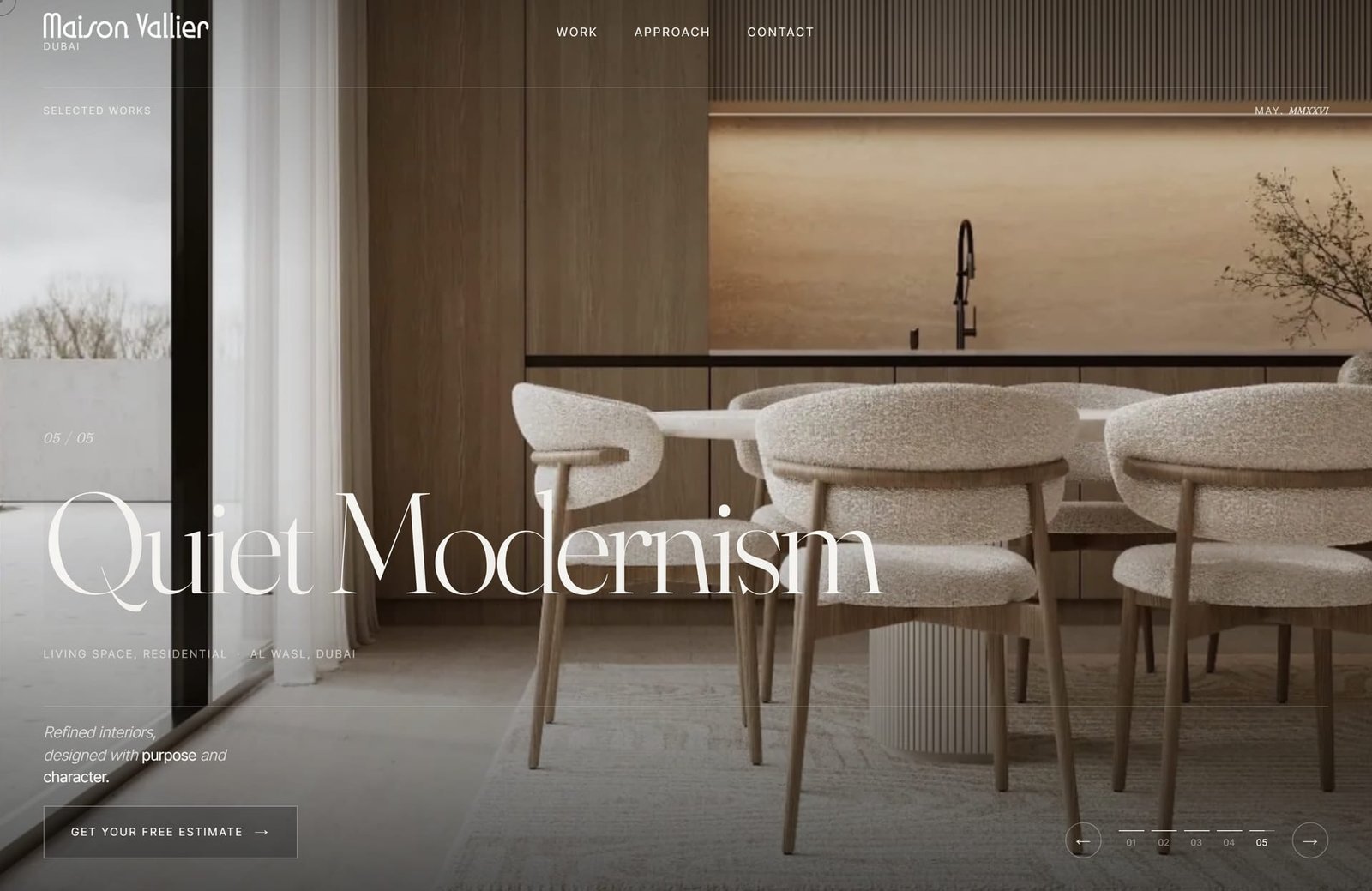
Full-screen from the first second: one photograph, one title, one promise. “Quiet Modernism” sets the tone before a single scroll.
Maison Vallier designs interiors where atmosphere outweighs ornament. Our first decision was radical: erase the interface. No cards, no tight grids, no noise. A single full-frame image, a serif title the size of a poster, and room to breathe.
“Quiet Modernism,” “Serene Brutalism,” “Echoes of Matter” — each project carries a name, like a work of art. The brand doesn't introduce itself, it stages itself: a drawn logo, a menu cut to three words, a discreet “May · MMXXVI.” Everything points to a maison, not an agency.
“
Spaces designed to be felt. Not seen. Not used. Inhabited.
That line, signed by Maison Vallier, became our brief: a site you feel, not a brochure you skim.
Every project is discovered the way you enter a room.
Rather than a grid of thumbnails, we built a narrative. You don't click a project: you step into it.
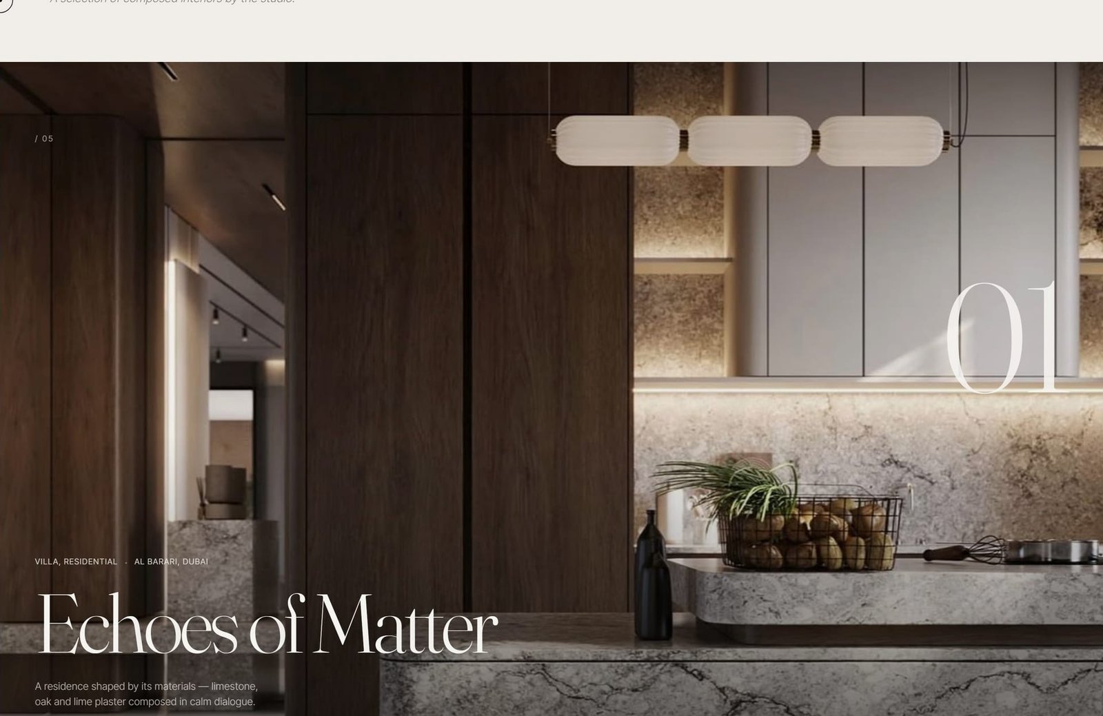
Each project becomes a numbered chapter — 01 to 05 — revealed full-screen as you scroll. “Echoes of Matter,” a villa in Al Barari.
The portfolio is composed as a sequence of tableaux. As you scroll, each project takes the full screen: a large watermark number, the location (Al Barari, Al Wasl), the typology, a single sentence. The motion is slow, restrained — like the spaces it presents.
Under the hood, the site is built on Astro: high-definition photographs are served as AVIF, sliced and loaded on demand, so that visual density never costs a second of waiting. Here, luxury is also fluidity.
“
Each room, an atmosphere. Each project, a signature.
The browsing experience says exactly what the studio sells: an obsessive attention to detail and rhythm.
A beautiful site that doesn't convert is just an expensive business card. The centerpiece had to lead to one gesture: get in touch.
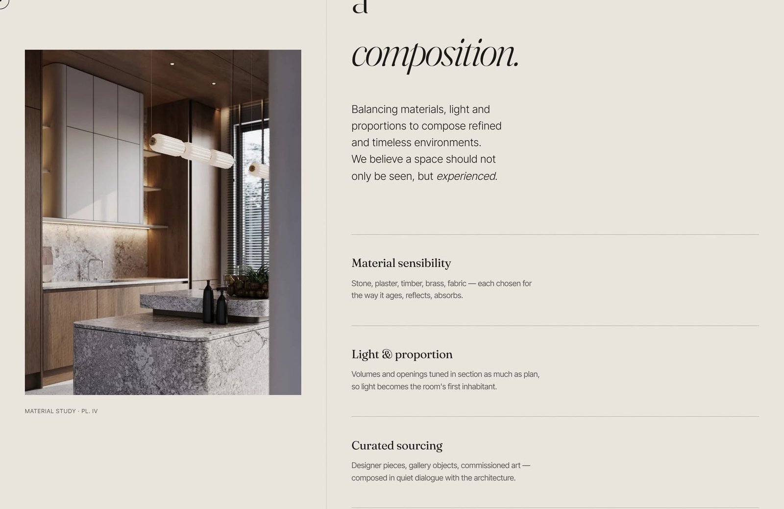
The “Approach” page translates the studio's method: material sensibility, light & proportion, curated sourcing.
The “Approach” page puts words to the intangible, then breaks it into three pillars: material sensibility, light and proportion, curated sourcing. It's the proof of method that reassures a high-end client before the first meeting.
Everywhere, a single call to action returns, calm and self-assured: “Get your free estimate.” Paired with a “Studio open to commissions” badge and direct channels — email, Instagram, WhatsApp — it turns emotion into a sales conversation, without ever breaking the mood.
“
There is a moment in every room when atmosphere becomes tangible. We design for that moment.
That's the whole point of a signature site: not to interrupt the dream to sell, but to make the sale the natural continuation of the dream.
Aruba Lanka designs, hosts and automates digital presences for brands that bet on atmosphere as much as on product. To translate yours into a site people feel, write to us.